Wherever you may wander, wherever you may roam.
No matter your preferences, Wander can help you find the right travel plan.
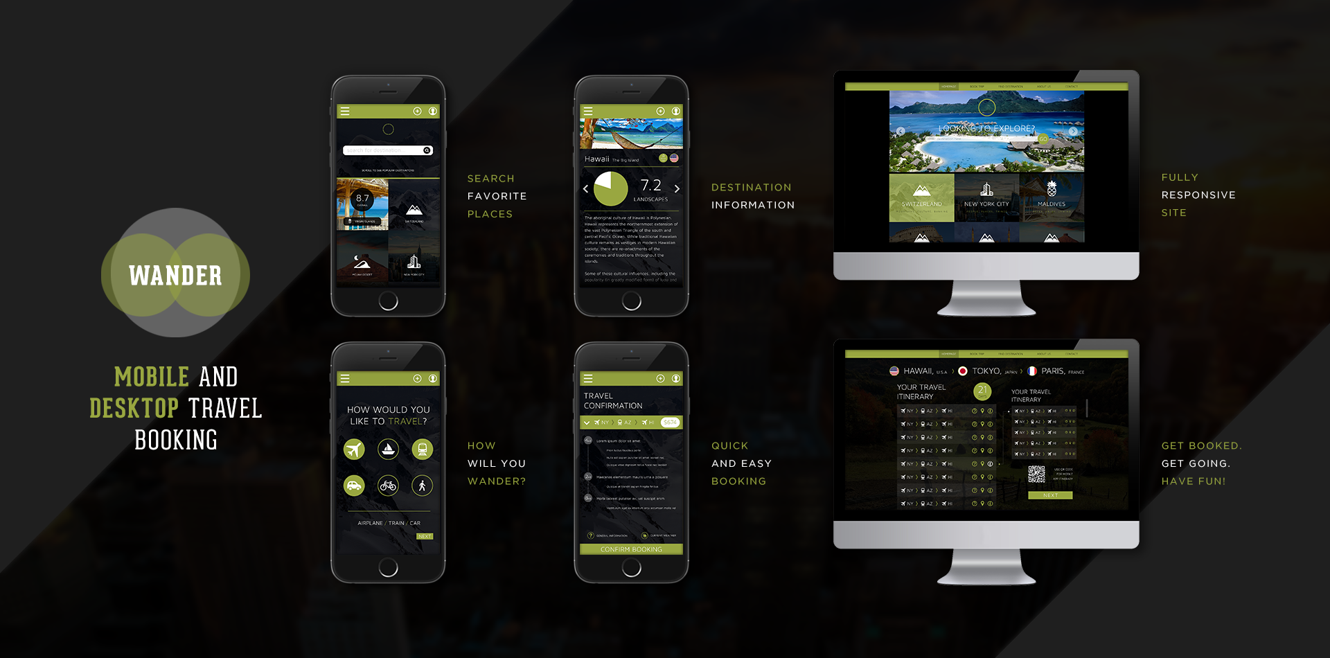
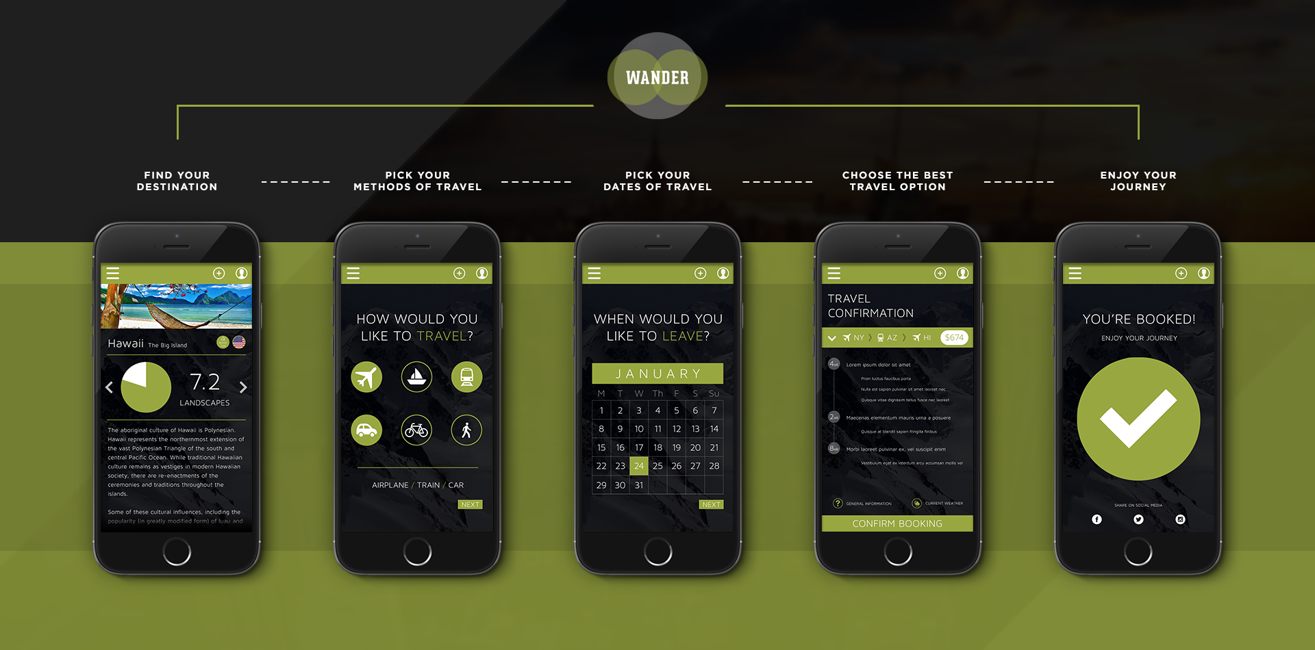
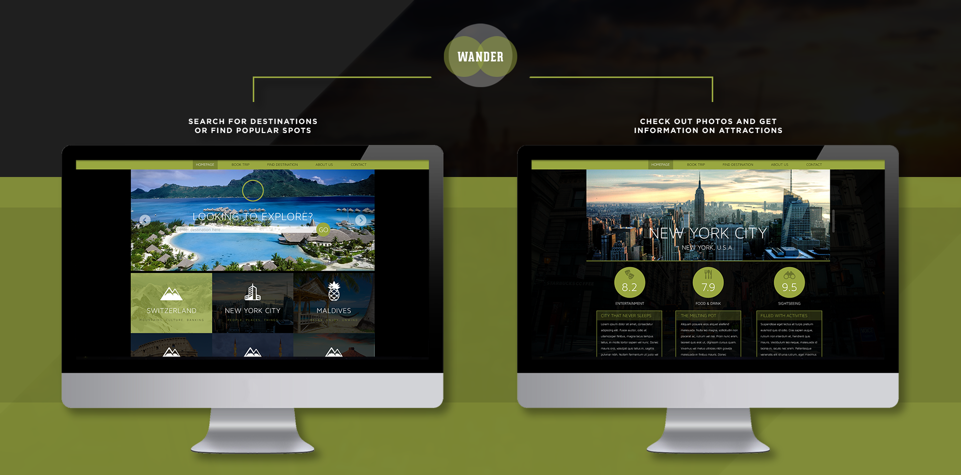
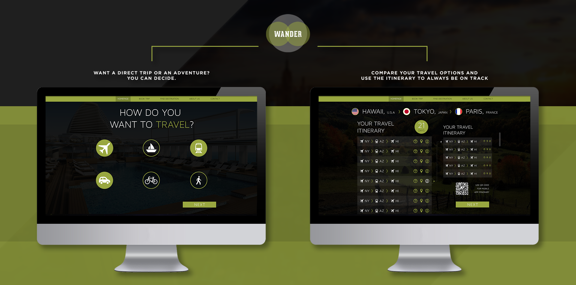
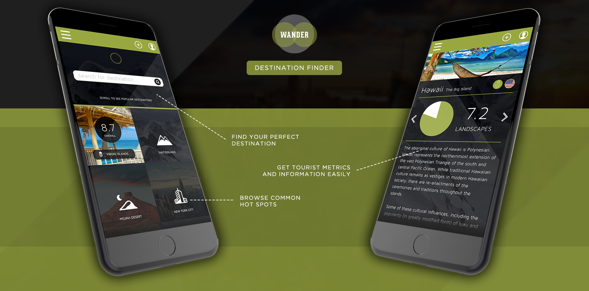
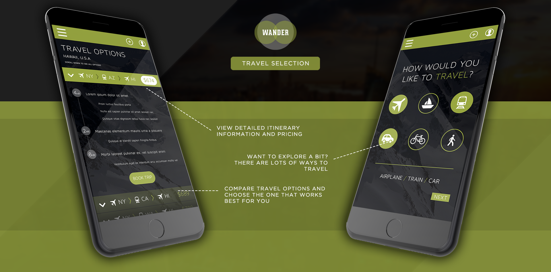
View UI/UX Documentation Wander was designed with the travel bug in mind. At its core Wander allows the user to find a specific (or multiple) destinations, and set a travel plan that works best for them to get them to those destinations. There is a heavy emphasis on clean and modern design to make navigating the application a fun and engaging experience. The application was developed to share a seamless experience whether on mobile or desktop and it should feel like remaining on the same application when moving from one platform to another. The application can divide its function between two dedicated 'modes', one mode is for finding a specific destination/browsing common hotspots, with the other 'mode' being a travel booking process. The application has the user go through a small series of input prompts (what day are you travelling/returning, etc), and provides the user with multiple travel plans. The user can then pick the travel plan that works best for their specific needs. Balsamiq Mockup wireframes and Invision Application Prototype (in development) available upon request.UI/UX Project Overview
Wander was developed as a solution for users that want to find destinations, compare prices on traveling to those destinations, and ultimately, if they'd like, book travel plans. The application design and content development was driven by field research, user mapping, and by examining existing processes within the travel booking industry. Wander is designed and functions on both mobile (iOS & Android) and web and looks to provide a seamless user experience between the two platforms.
Info Gathering & Research
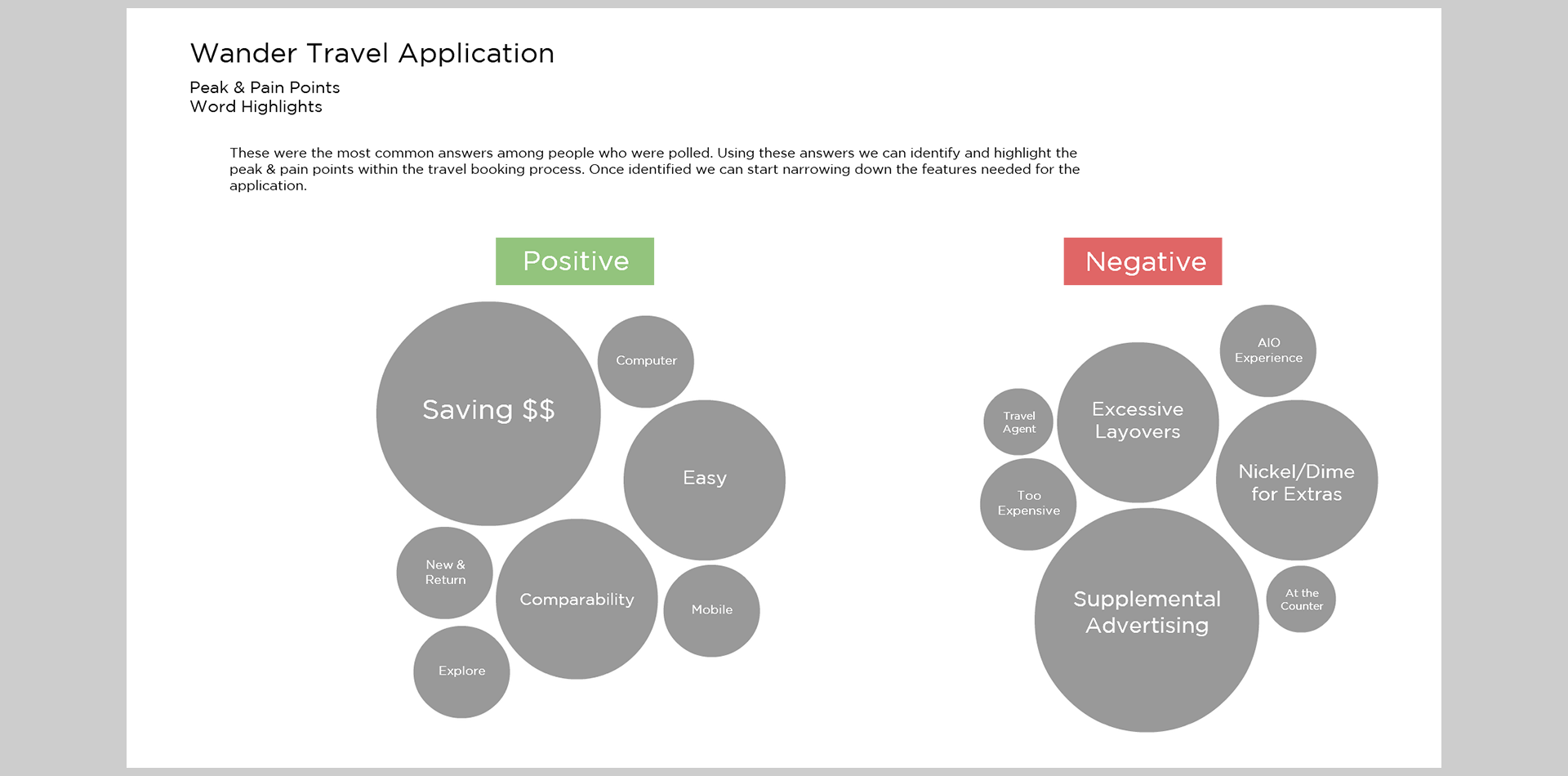
My initial research was polling 35 people at the Mall of America, I asked people some basic questions and allowed them to answer however they liked and logged all the answers. Once I had my data I began to reorganize it by the popularity of answers to help me better understand what the user needs. I was able to identify common 'peak' and 'pain' points among the answers and separated them out by grouping and looking at the groups a bit closer I could start to pinpoint the things the application needed in order to satisfy the users.
The Main Content Pillars
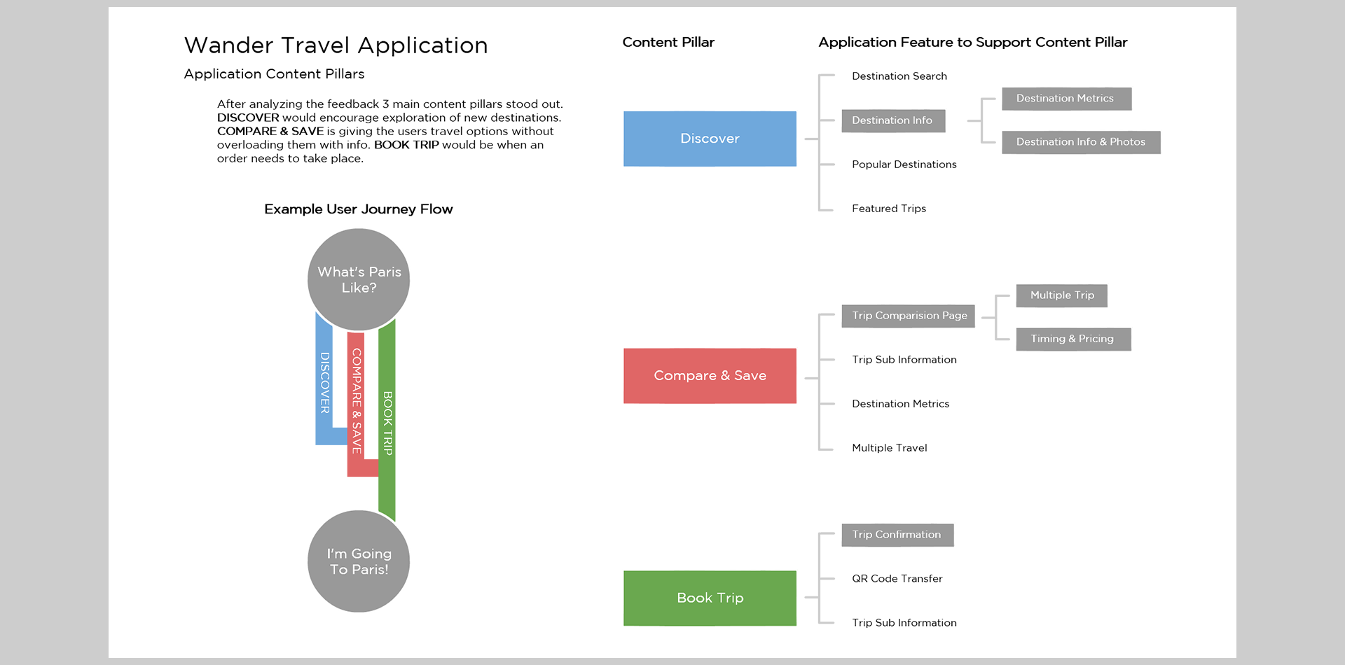
Once the research was examined I identified 3 content pillars that would exist to solve user needs: Discover (browse or search for a new place), Compare & Save (provide information for user to find best deal), and Book Trip (User books travel plans). These would serve as the main functions and user journeys for the application and warranted further process examination. Before I got too far though I wanted to take a step back and think about the potential user-base to make sure that I included features that would make sense for all types of users.
User Profiles
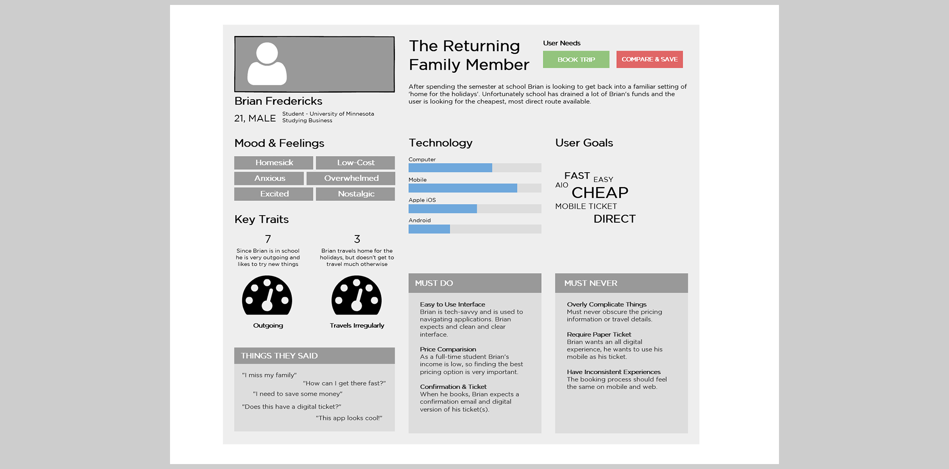
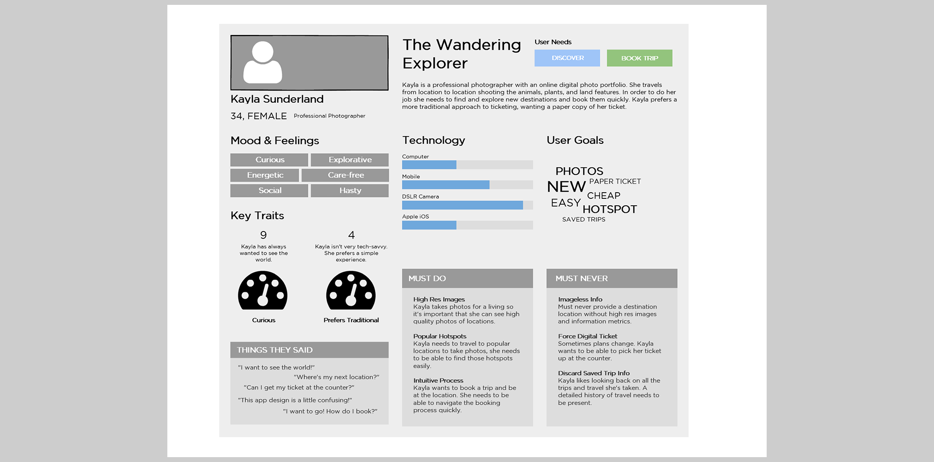
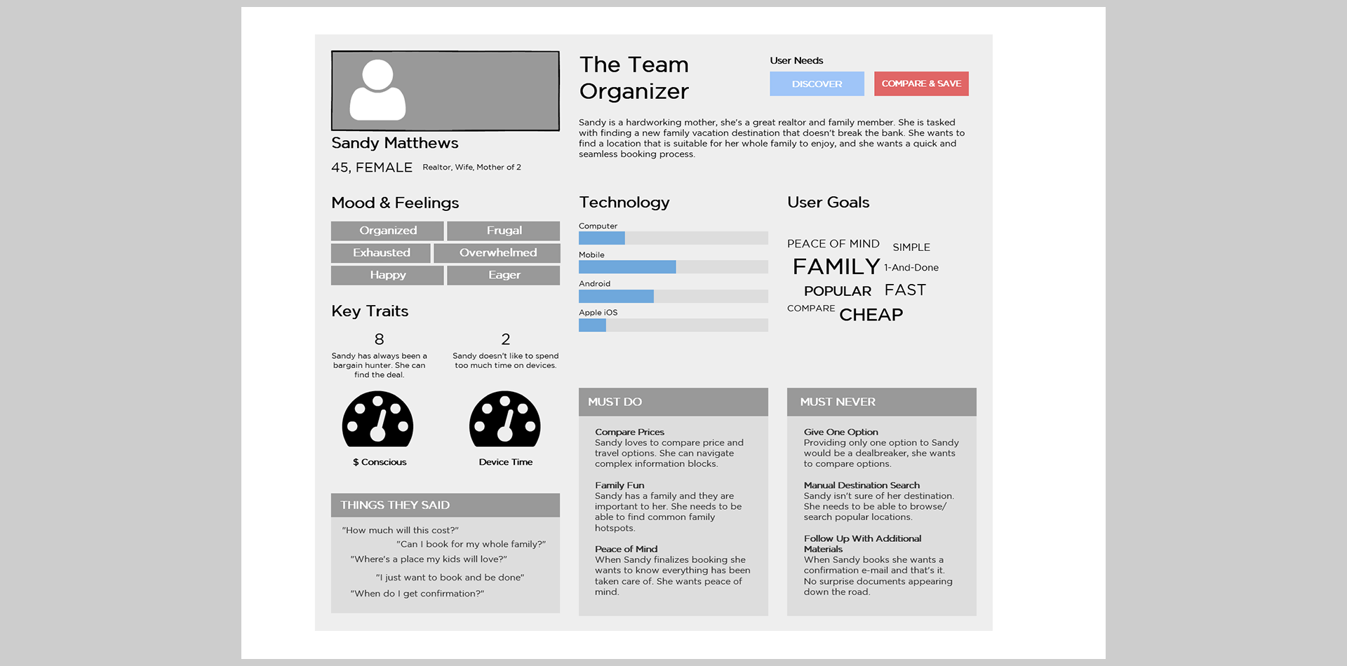
In order to get a better understanding of the user base I created a few user profiles, these profiles attempted to get into the mindset of a variety of users so that I could better gauge roadblocks or pitfalls the application needed to avoid to ensure a better user experience. I was able to create 3 diverse profiles with different backgrounds and needs: Brian the Returning Family Member (Book/Compare), Kayla the Wandering Explorer (Discover/Book), and Sandy the Team Organizer (Discover/Compare).
Process Examinations
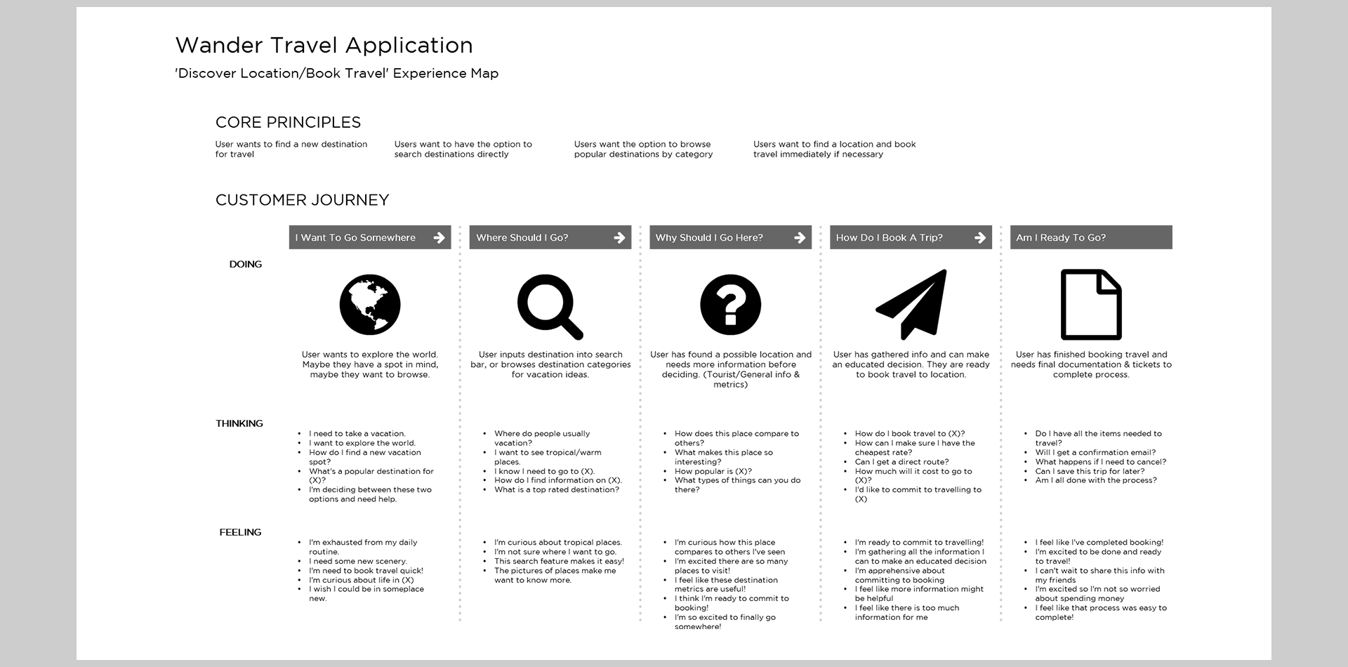
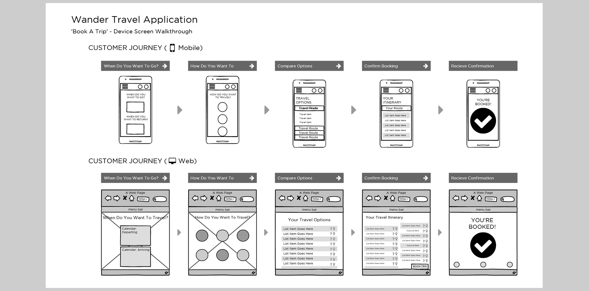
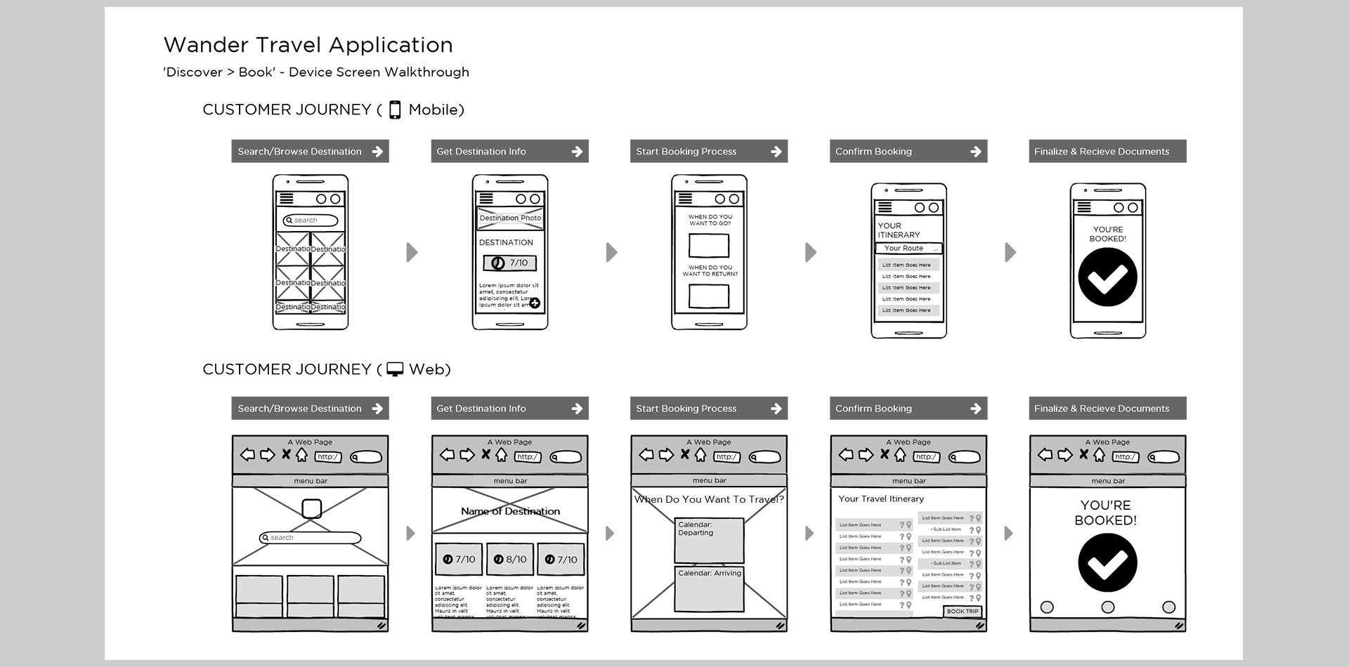
There were two main processes in the application that needed to be examined: the user wants to book a trip, and the user isn't sure where they want to go so they must find a destination and then book a trip. I decided to explore the core ideas of those processes and broke them out into user actions, thoughts, and feelings. The process studies followed the users journey from “I want to go somewhere” to “I'm booked and going” to ensure I was working with the complete spectrum of information.
Conceptual & Wireframes
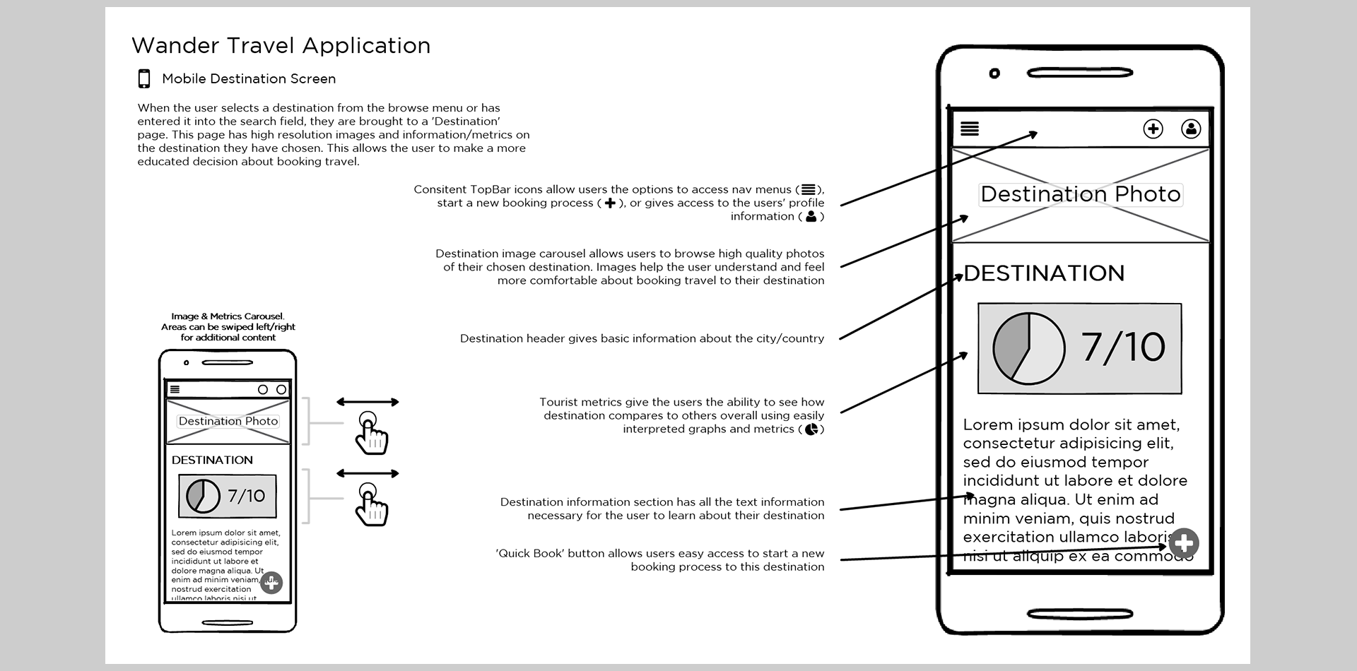
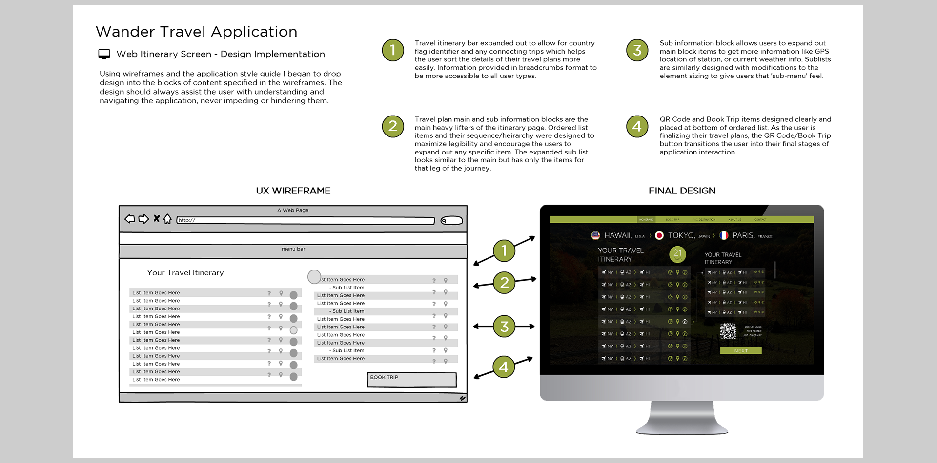
Following the same sequence as the process examinations, and keeping in mind the 3 main content pillars/user needs, I began to drop in blocks of content and functionality into wireframe mockups. I walked through each process and used the content pillar functionality tree I created earlier to make sure that all blocks had a purpose and weren't confusing for users. Once I had the assets and screens created for the main processes I began to work outward on the other items like menu, settings, and search screens eventually creating a complete set of wireframes.
Final Design
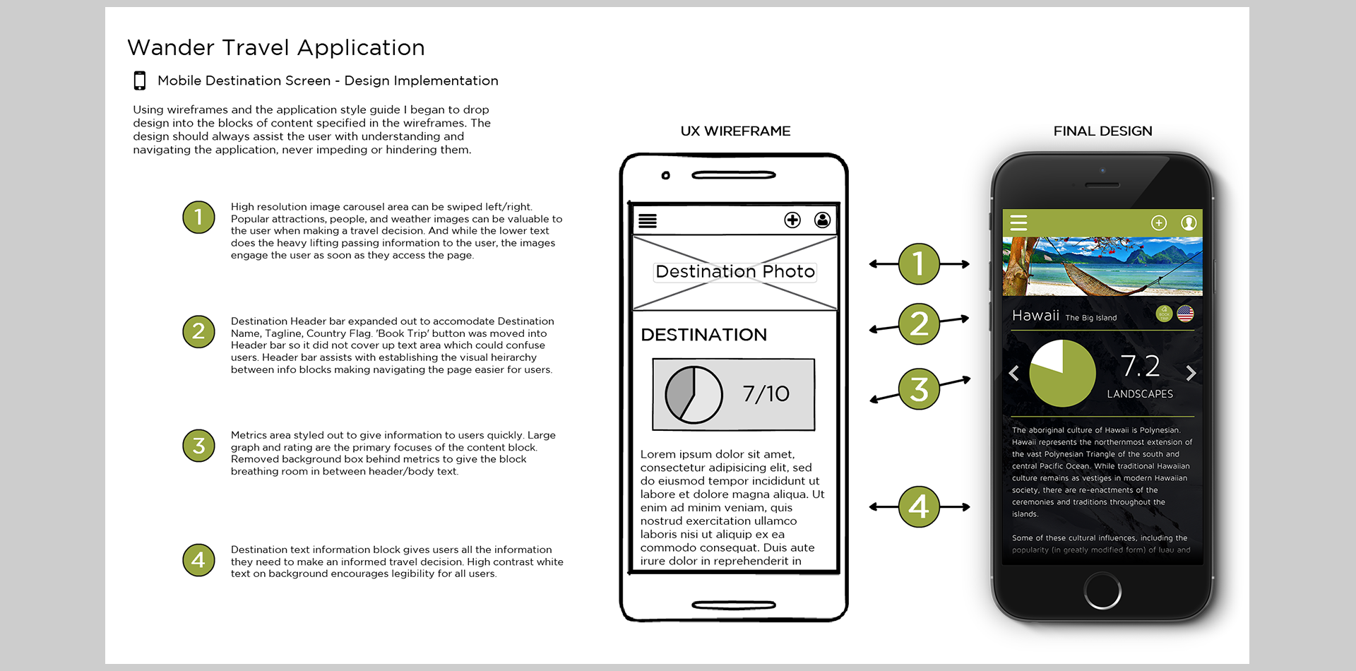
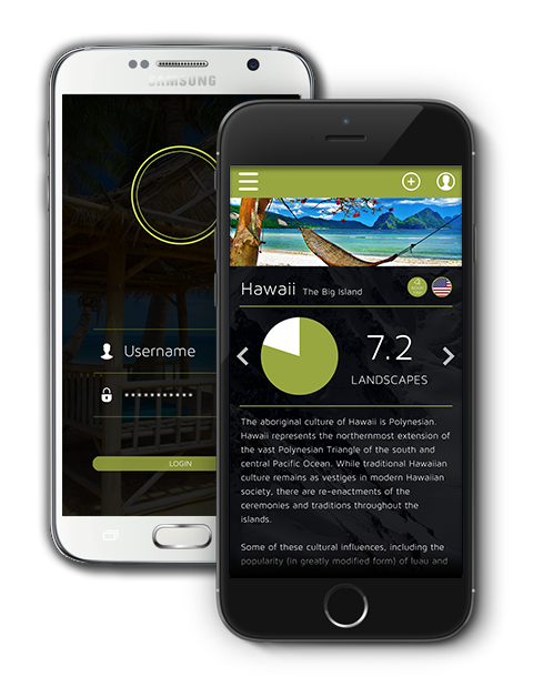
Once I had the wireframes in place and the functionality laid out, the time came to build up the design. I worked to develop a design palette that would engage and excite users; plenty of applications have stark white backgrounds with sub-par images and information architecture, I wanted Wander to be something that felt polished and provided high-res imagery and information as the primary focus. I eventually settled on a high contrast palette that used green and white highlights, and images with black overlays which encouraged the content to be the focal point and had the added benefit of clarity which made navigating the information much easier for users.
Services GiftedPixel Can Provide
Useful Links
Portfolio Breakdown
About
I'm a versatile designer who specializes in User Experience & Interface Design for the mobile/web environment.
My goal is to create beautifully structured designs that are memorable and get clients excited.
