No more headaches when building your new computer.
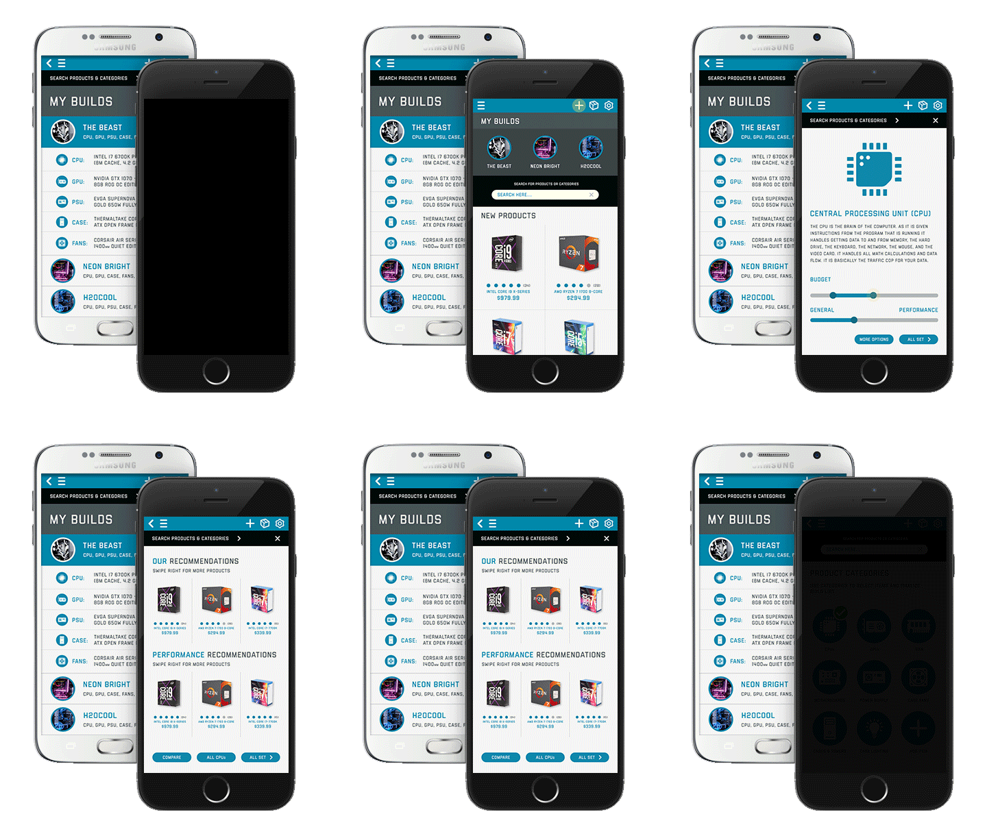
Explore, pick, and save your favorite parts for your build.
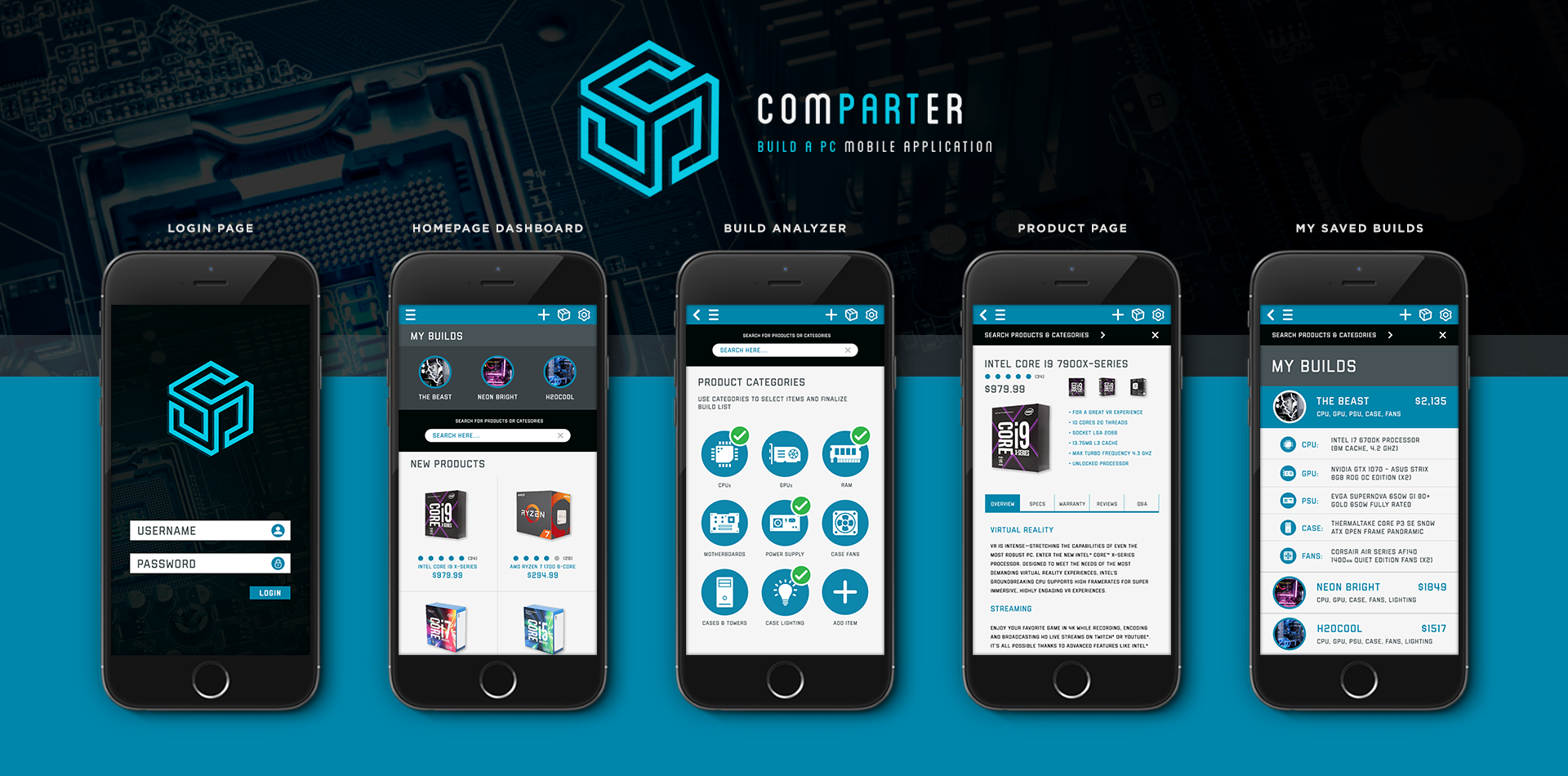
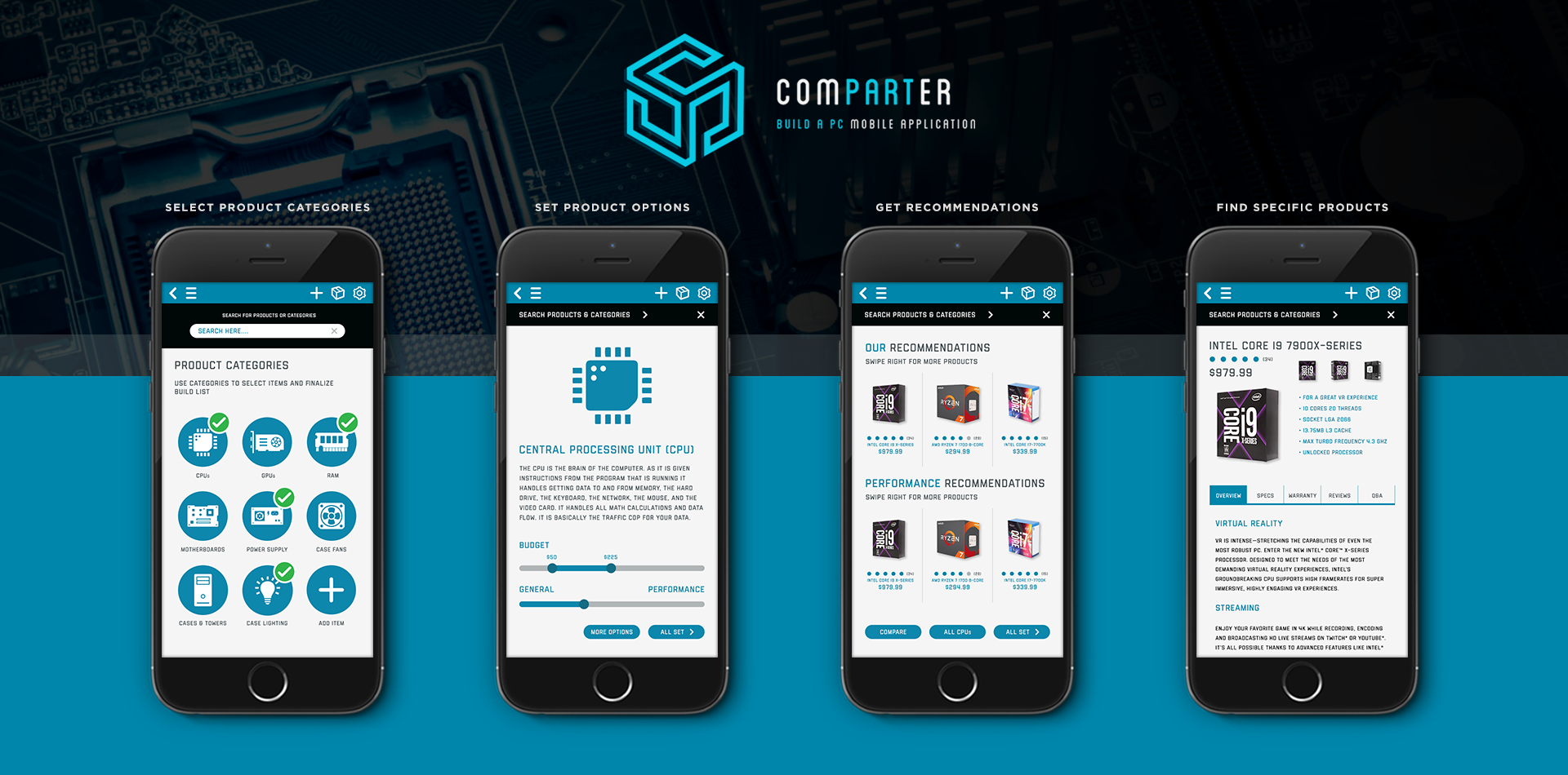
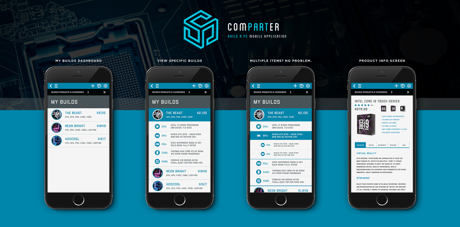
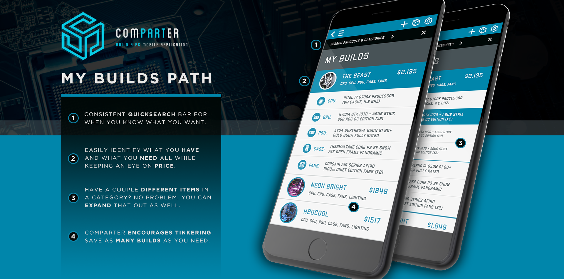
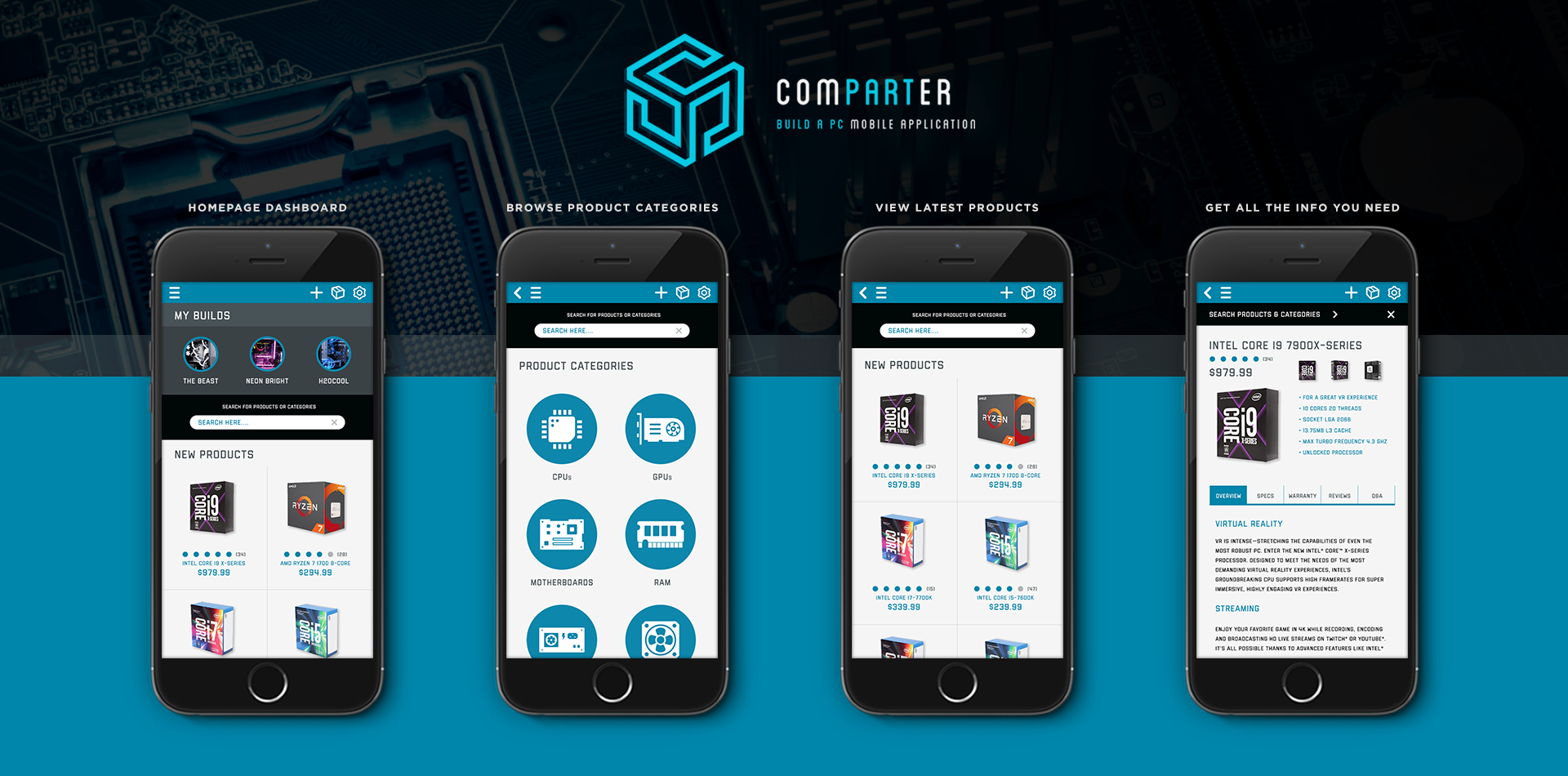
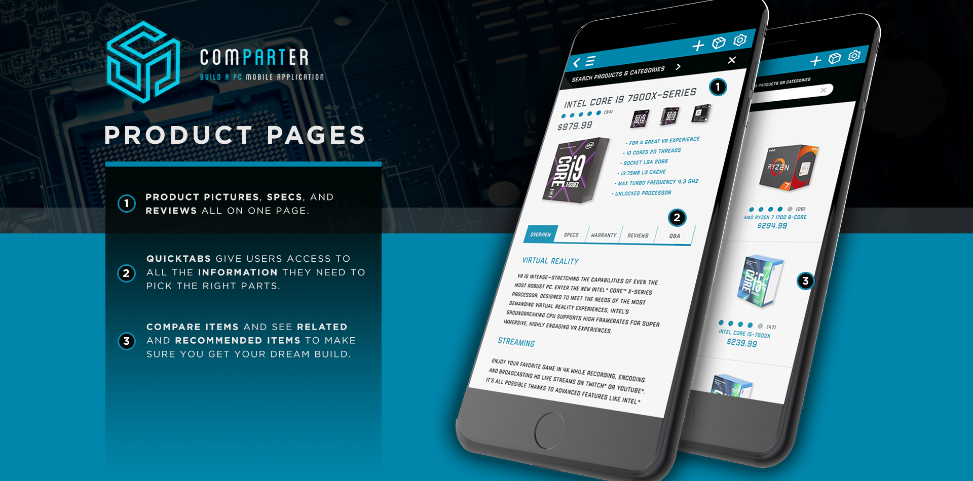
View UI/UX Documentation Building your own PC can be a lot of fun. Whether you're a gamer, a tinkerer, or just enjoy computers building your own PC can be an engaging and empowering experience. There is a lot of information out there, and it can be overwhelming to builders to find the products they need at the best price points. That's where “Comparter” can help. Comparter allows users to start a PC build from scratch and when picking a specific item category Comparter boils it down to 2 questions, “What is your budget?” and “Do performance parts matter to you?” Based off these inputs, Comparter then provides a list of recommended parts for that category. Comparter also allows users to take any builds and save them out into a dashboard. This means that users have the power to complete full builds and visually compare them easily without having to dig into the details too much. Balsamiq Mockup wireframes and Invision Application Prototype (in development) available upon request.UI/UX Project Overview
Comparter was developed as a solution for users that want to find & buy PC products, save pre-configured PC builds, and learn more about PC parts and building in general along the way. The application design and content development was driven by field research, user mapping, and by examining existing processes within the PC part picking/building industries. Comparter is designed and functions on mobile (iOS & Android) and looks to provide a consistent user experience between the two mobile platforms.
Info Gathering & Research
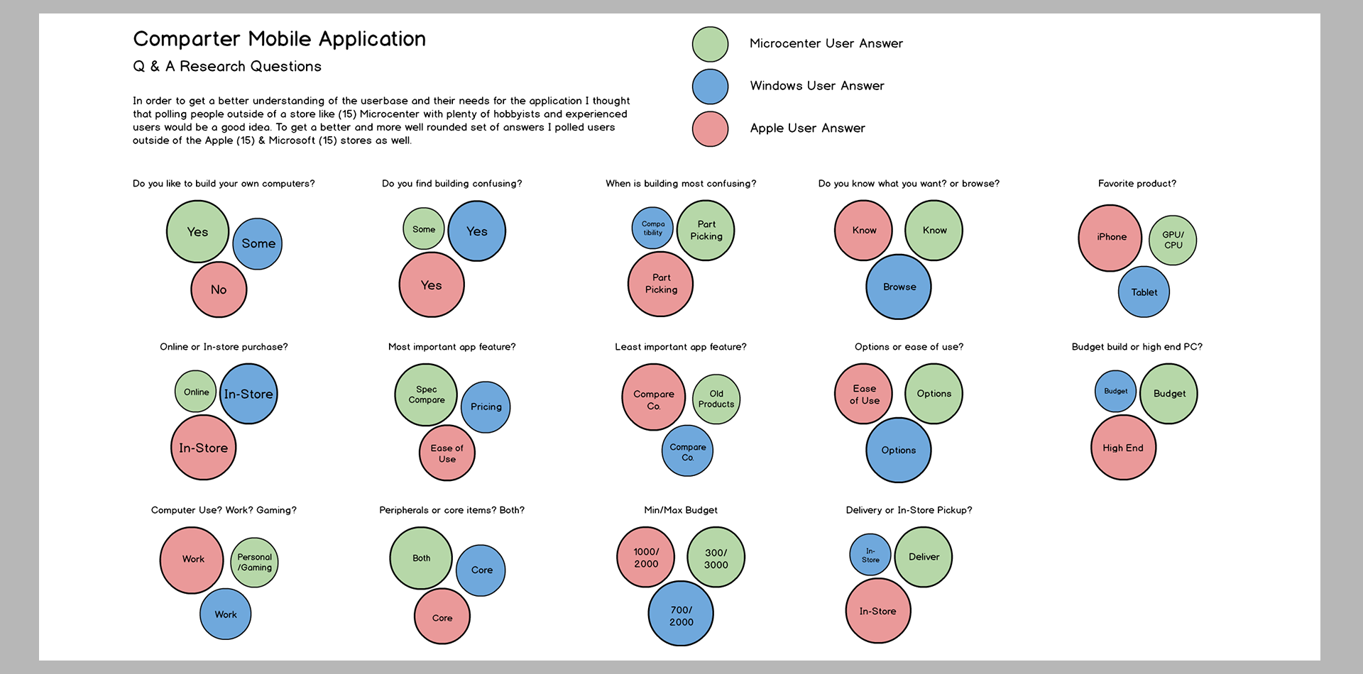
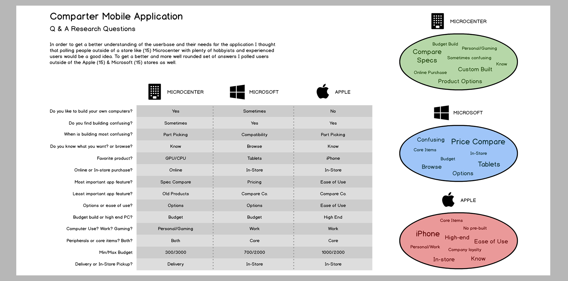
My research and findings consistented of polling 45 people at Microcenter, Apple, and Microsoft stores, I asked people some basic questions about their experience and interest in PC building and documented the findings for later distillation. Once I had my data I began to break it out by the popularity of answers to help me better understand the common user experiences. Using this data, I was able to create a Purpose Document which details out application features, functions, and user needs that are vital to the applications success.
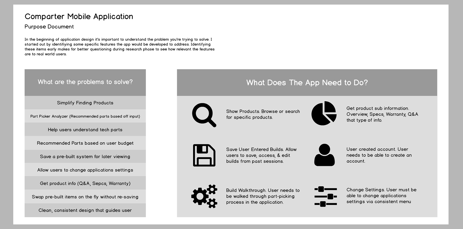
The Purpose Document
Using the research I gathered as a guide, I was able to determine several key features the application needed. The core features needed were: show products, start a new PC build, access previously saved builds, and some more general features like changing application settings, and creating a user account. Identifying these features early makes all further design work easier since I can ensure that any design/layout choices bolster the 'foundation features' rather than hinder them.
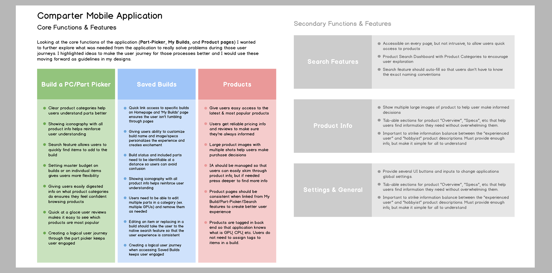
'Foundation Features' & Flow
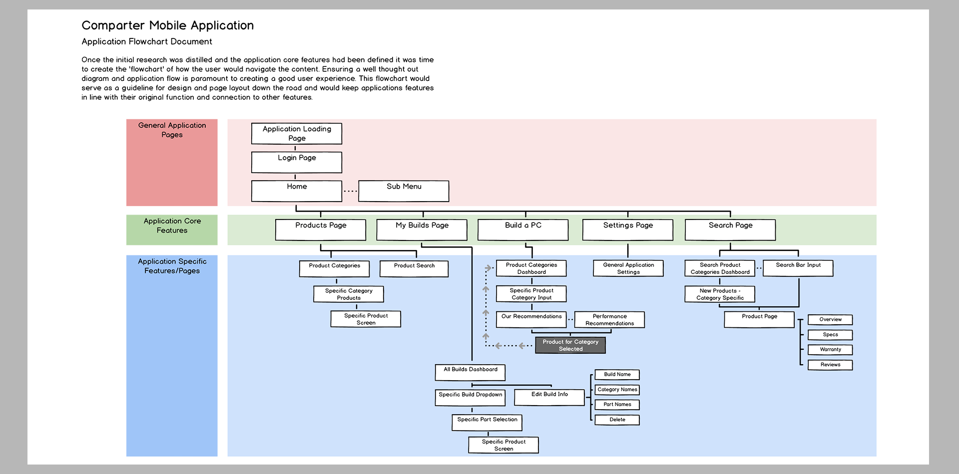
I felt it was important to further expand out the 'Foundation Features' to get a better understanding of how each feature would address users' needs. I also examined some of the secondary features like searching and product info sections to ensure those features felt intuitive to use. Once I felt I had a good understanding of the features, I laid them out in a sitemap to document the application flow. I would use these documents as a framework for the application as well as to keep my design and layout aligned throughout the application building process.
User Profiles
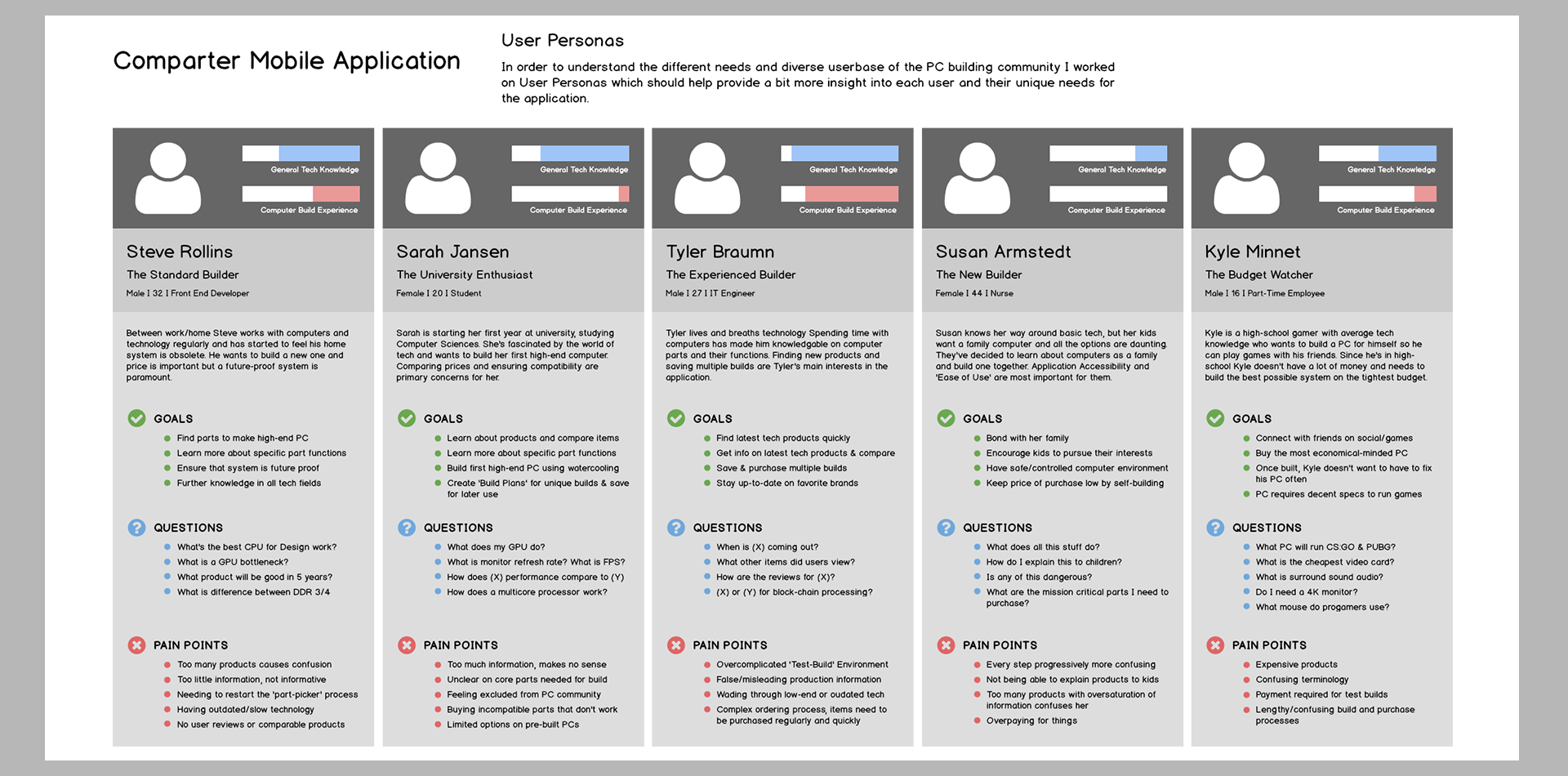
In order to get a better understanding of the user base I created a few user profiles, these profiles attempted to get into the mindset of a variety of users so that I could better gauge roadblocks or pitfalls the application needed to avoid to ensure a better user experience. I was able to create 5 diverse profiles with different backgrounds and needs: Steve (Standard Builder), Sarah (University Enthusiast), Tyler (Experienced Builder), Susan (New Builder), and Kyle (Budget Watcher).
Process Examinations
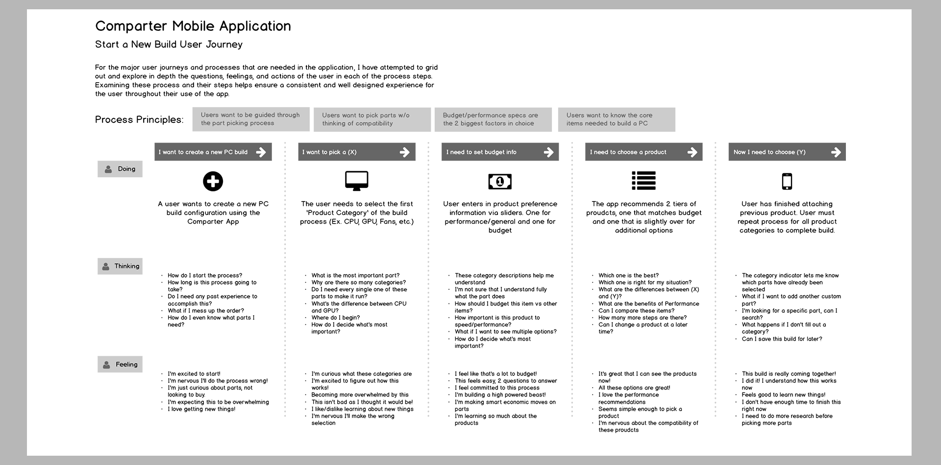
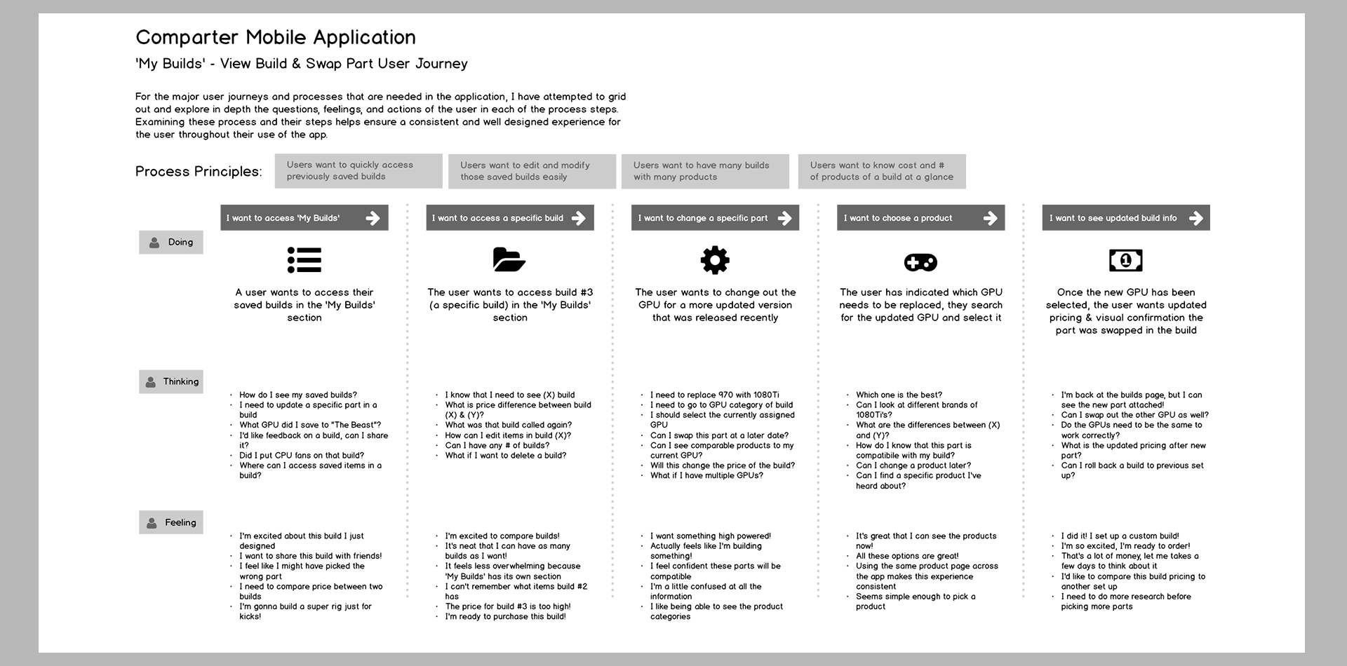
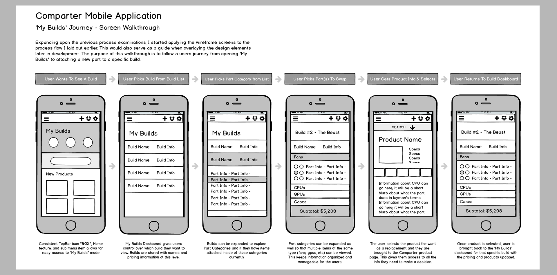
There were two main processes in the application that needed to be examined: the user wants to start a new PC build, and the user already has previously saved builds that need to be modified.. I decided to explore the core ideas of those processes and broke them out into user actions, thoughts, and feelings. These process examinations are important because they follow the user through each journey, they give crucial insight on how users are interacting with the application, and how they are feeling while doing so.
Conceptual & Wireframes
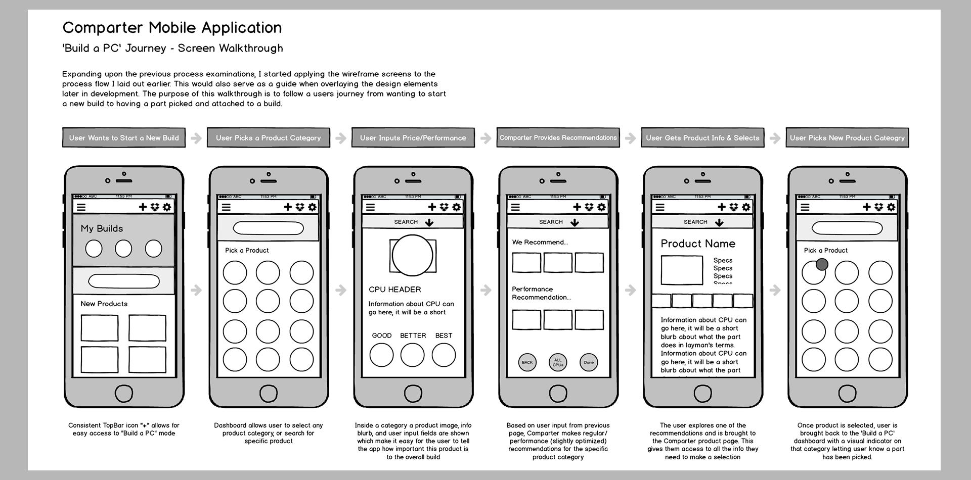
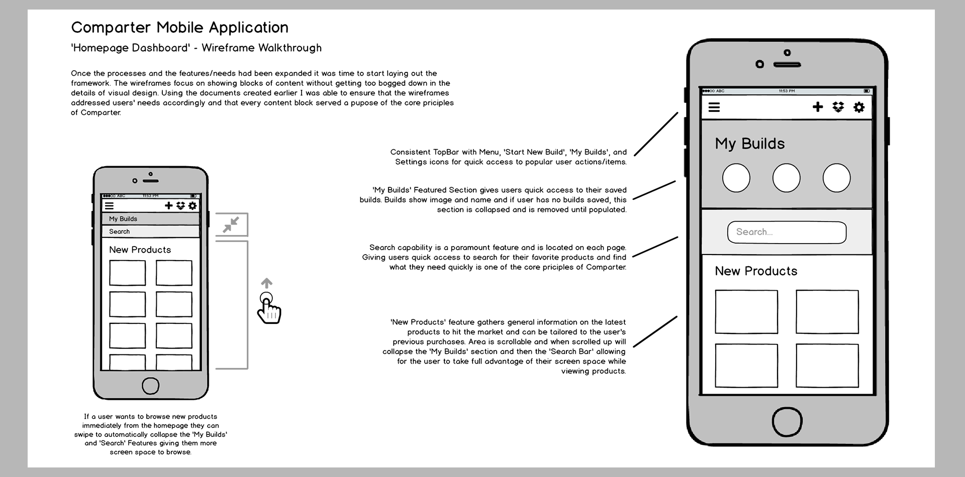
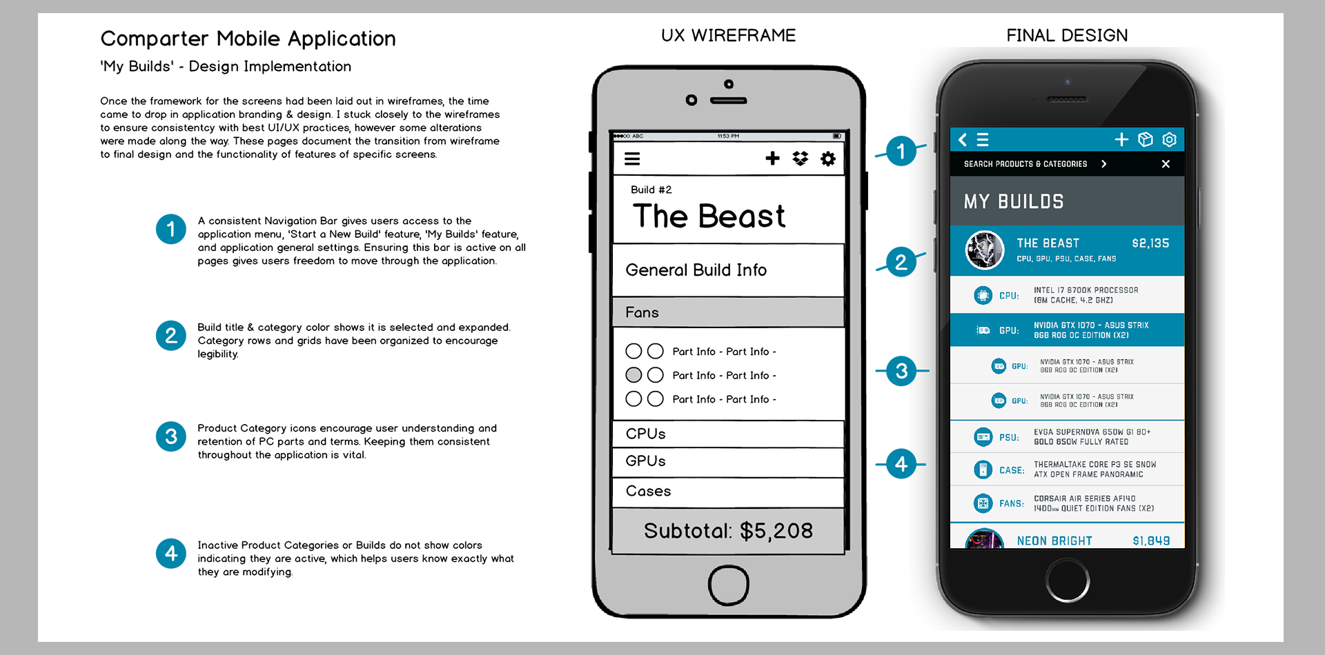
Following the same logical sequence as the process examinations, and keeping in mind the 'Foundation Features'/user needs, I began to drop in blocks of content and functionality into wireframe mockups. I walked through each process and used the application purpose and feature documents I created earlier to make sure that all blocks had a purpose and weren't confusing for users. Once I had the assets and screens created for the main processes I began to work outward on the other items like menu, settings, and search screens eventually creating a complete set of wireframes.
Final Design
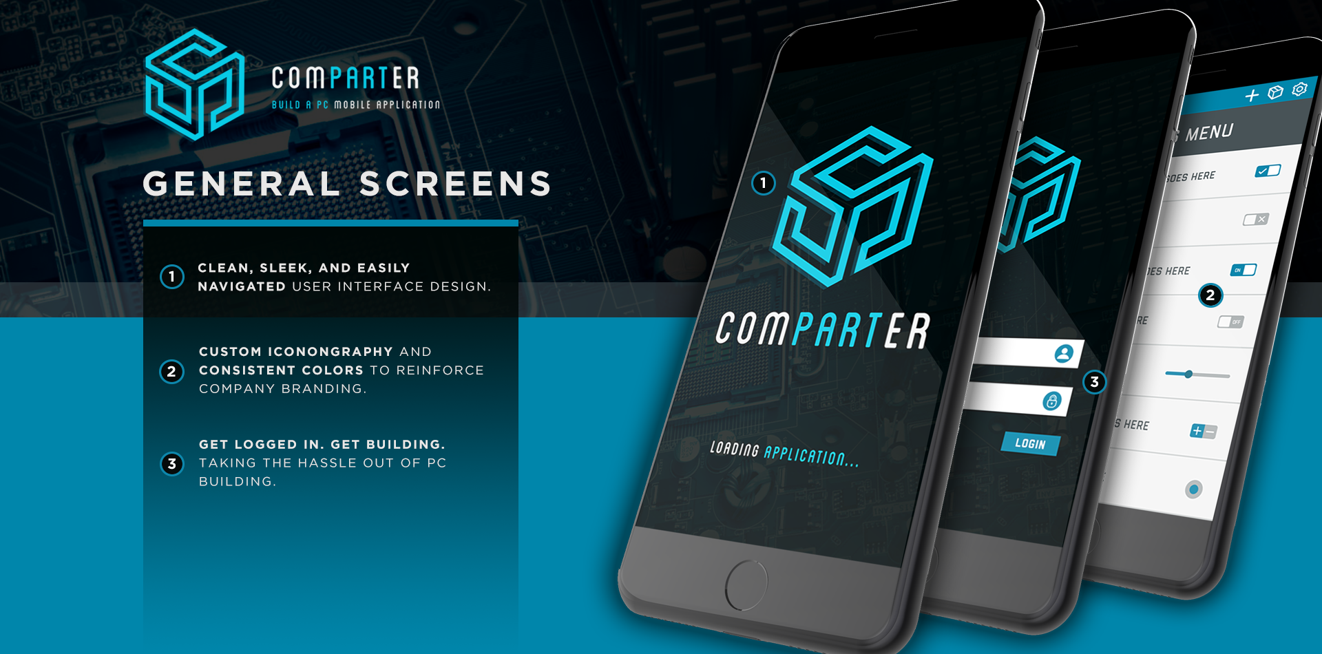
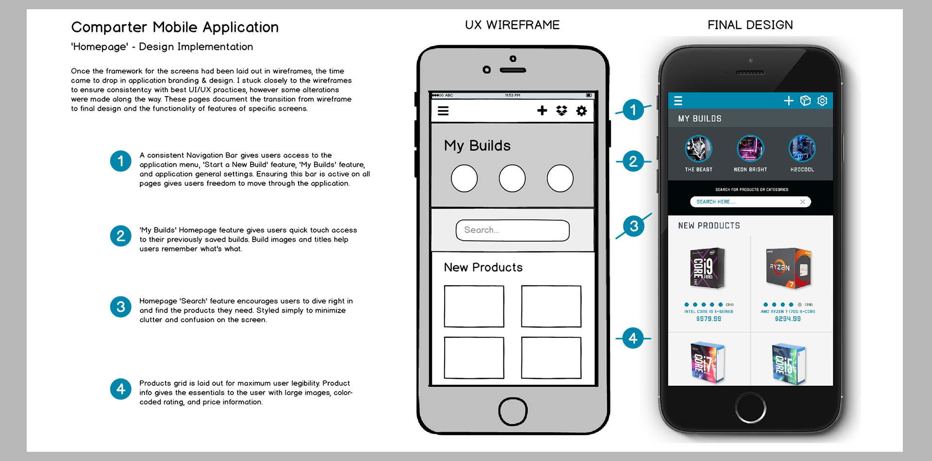
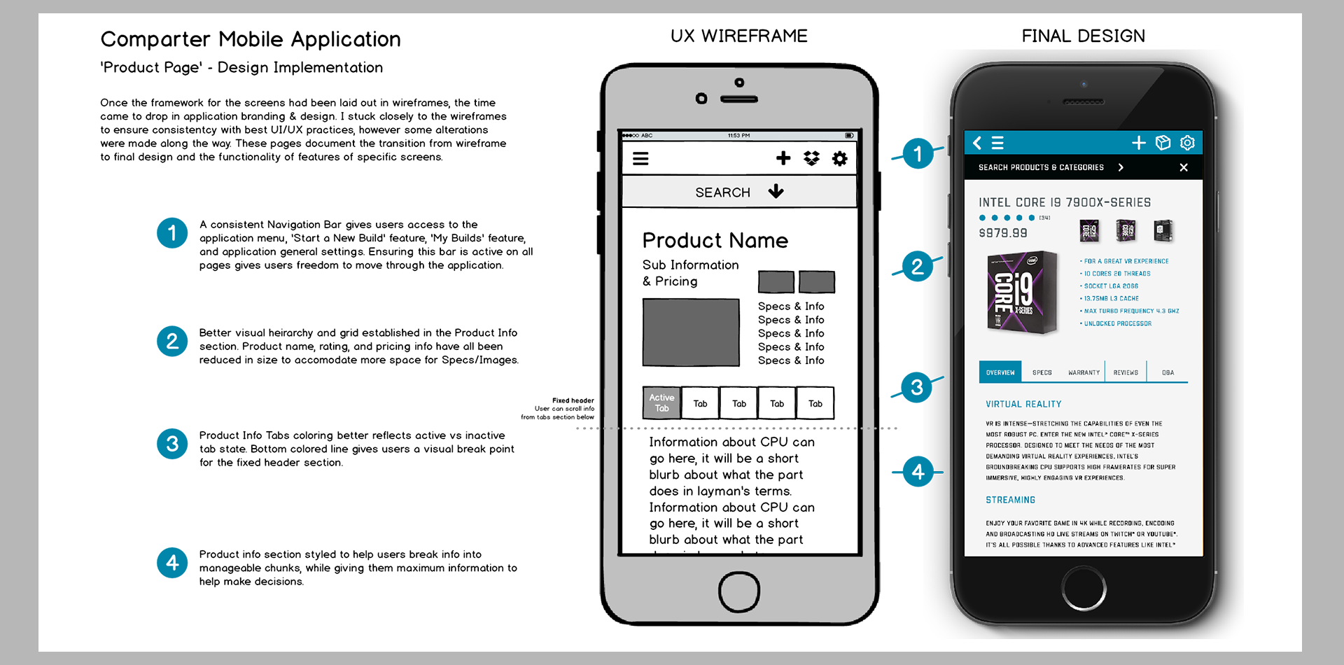
Once the wireframes were in place and the functionality laid out, it was time to develop a design palette and fill in the wireframes. I worked to develop a palette that would engage and excite users, also relying on white grids and item spacing to increase legibility and ease of use. I wanted Comparter to be something that felt polished and provided quality product information and an intuitive build interface as the primary focuses. I eventually settled on a high contrast palette that used electric blues, grays, blacks with white highlights and high resolution product images, as well as clean organized informational architecture. Icons were a primary focus as well, keeping consistent with the use of them helps to bolster user learning and retention.
Services GiftedPixel Can Provide
Useful Links
Portfolio Breakdown
About
I'm a versatile designer who specializes in User Experience & Interface Design for the mobile/web environment.
My goal is to create beautifully structured designs that are memorable and get clients excited.
