
A parallax based website that makes you feel good.

Scrolling through the pages tells a story.
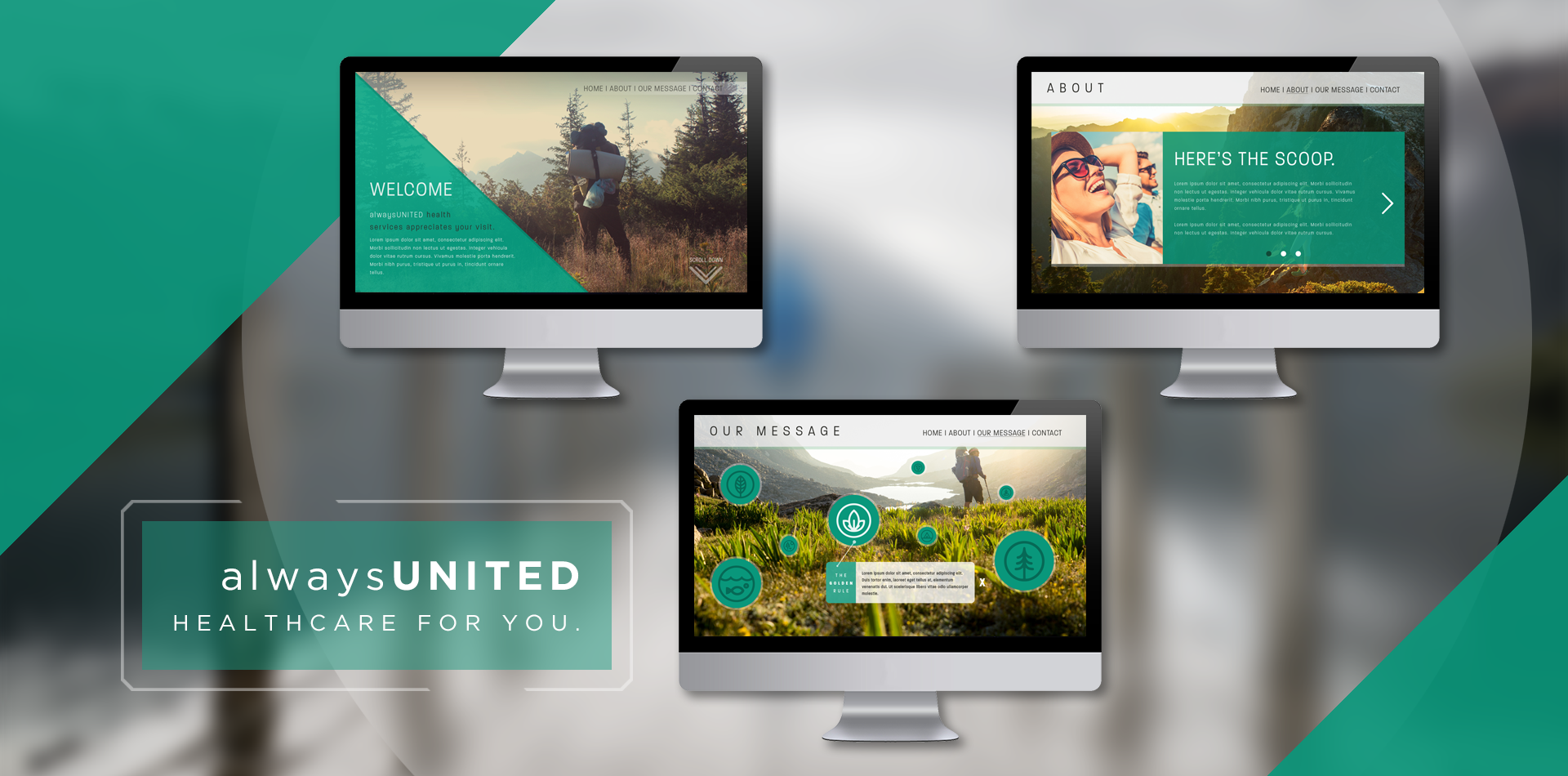
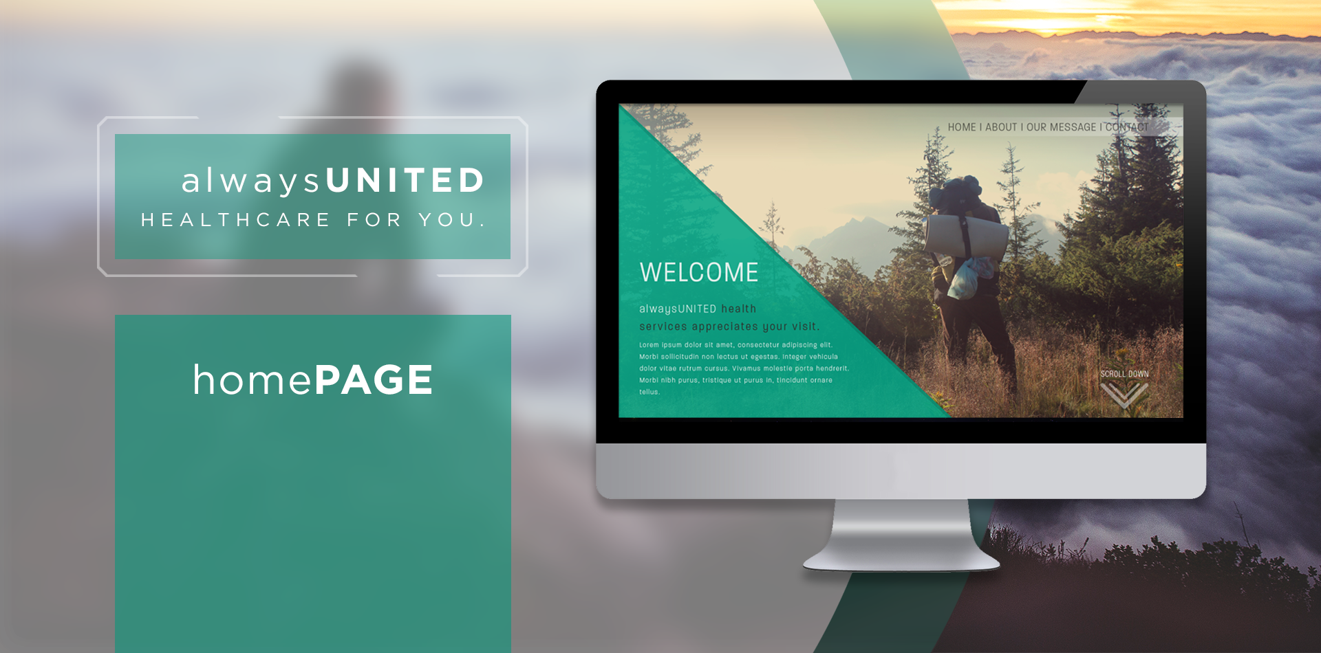
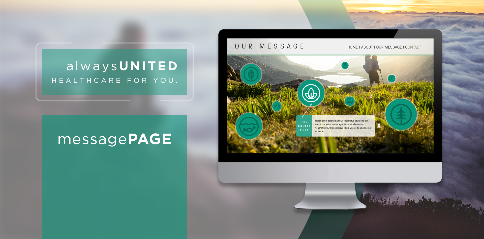
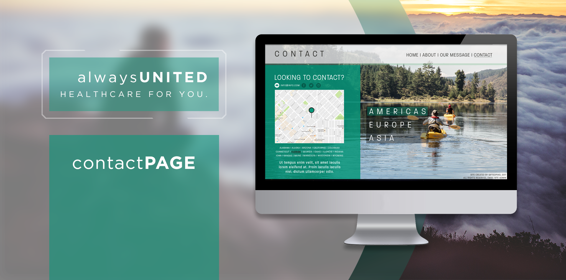
View UI/UX Documentation alwaysUNITED is a human approach to the daunting world of healthcare websites. When working on the idea and design, it was important to keep the site experience engaging so a parallax based website with high resolution background images was the way to go. Using this approach allowed each page to share it's own message and experience in a unique way without overloading the user with too much information. Though some complex UI elements like carousel sliders and pop up content blocks are used the focus was to present the information is the easiest and most engaging way possible. The user is first presented with the Homepage and general company information, once scrolling begins content elements begin their transitions onto the page. The flow of the site allows for the user to be introduced to the company, move on to the finer/complex points about the company in the 'About Us' section, engage the users in 'Our Message' section, and then allow the user the opportunity to engage the company in response on the 'Contact' page. The site design has been carefully crafted to be fully responsive and adaptive to different screen sizes. Balsamiq Mockup wireframes and Invision Web Prototype (in development) available upon request.UI/UX Project Overview
alwaysUNITED is a healthcare based website that uses Parallax scrolling to tell its story. alwaysUNITED looks to differentiate themselves from other 'colder' healthcare organizations with their branding and website engagement, making the experience fun and approachable for all users. The site relies heavily on Parallax, element transitions, and full width backgrounds to create a unique experience. Once users have completed their journey they are encouraged to contact alwaysUNITED through the site or via social channels.
Identifying Peak & Pain Points
I started this project by looking at the current standards in the healthcare industry and tried to identify areas that created positive and negative experiences for users, which I have dubbed 'Peak' and 'Pain' points. Looking at the peak and pain points to find a common theme or trend is important because it will help dial in the site content to ensure the site is promoting the type of experience which engages and excites users throughout their time on the site.

Building The Story
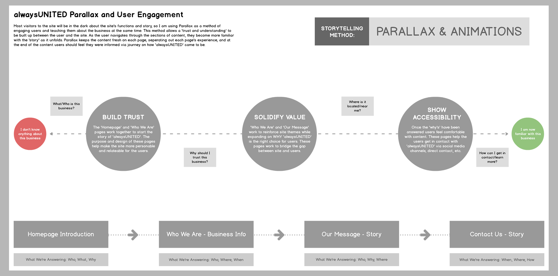
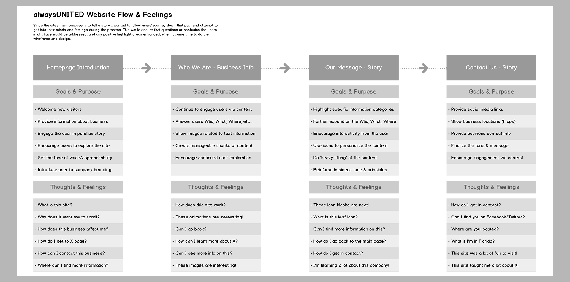
Using the 'Peak' & 'Pain' points guide created earlier, I started in on developing the story arch for the website. Since the site is primarily running Parallax I wanted to create manageable chunks of 'story' content for users to explore. The first stage: 'Build Trust' is built up on the 'Home' and 'Who We Are' pages and demonstrates WHY alwaysUNITED is different than other healthcare providers. The second stage: 'Solidify Value' is built on the 'Who We Are' and 'Our Message' pages and looks to reinforce the value alwaysUNITED can have for each user. And the final stage: 'Show Accessibility' is built on the 'Contact Us' and 'Social Media' pages and looks to connect the users beyond the story and site and into the realm of personal engagement. To continue development, I also created a 'Flow & Feelings' guide which attempts to get in the mindset of users as they progress through the story arch, and helps with identifying user confusion or pitfalls along the way.
Branding & Wireframes
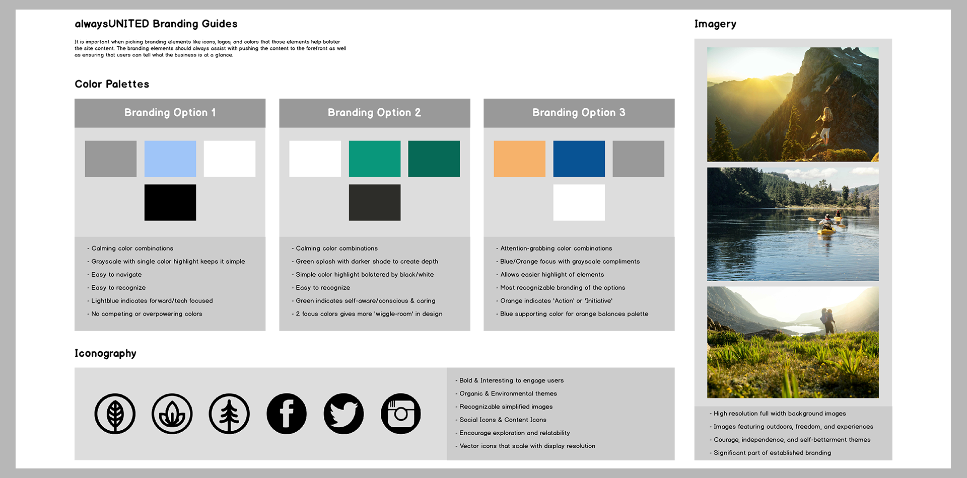
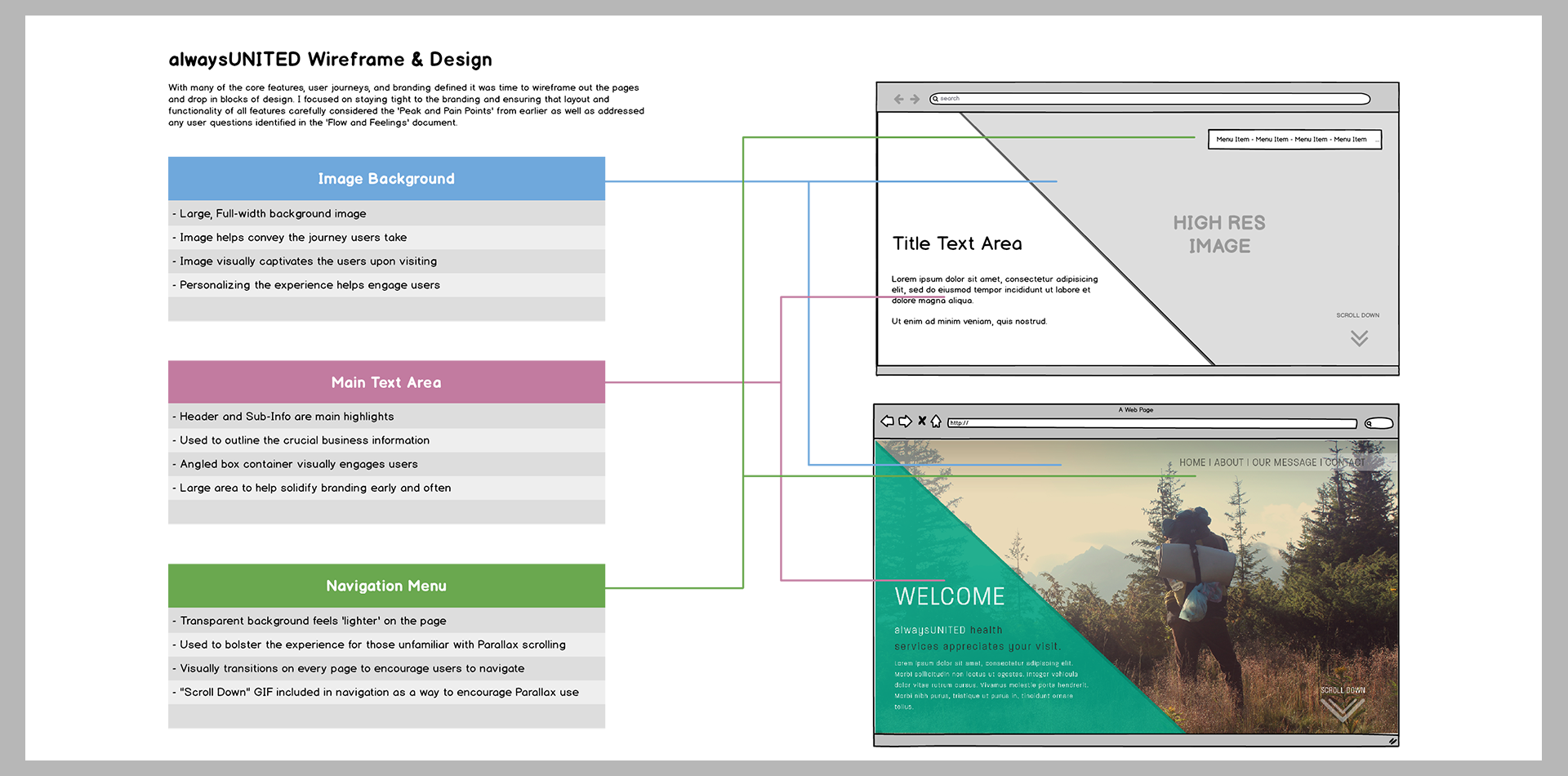
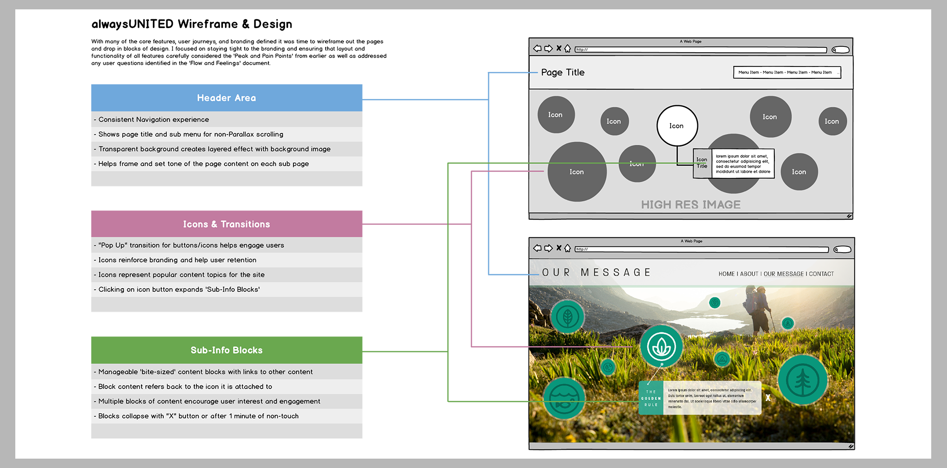
Once the story arch was finalized, it was time to start developing the overall layout and feel of the individual pages. Each page needed to have consistent branding to ensure that all pages felt like a cohesive story, as well as a logical page layout that felt intuitive to use alongside the Parallax functionality. I sampled a few color palettes, ultimately moving forward with the 'green-based' color palette, and tapped into image types and iconography I felt would help bolster the branding elements. I also began laying out the pages into wireframes to give me a rough roadmap of how the content would appear on the page, keeping in mind that elements would need to transition on/off the screen.

Transitions Guide
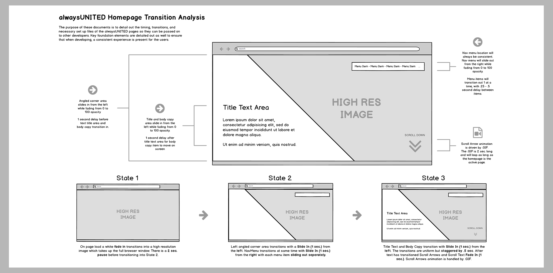
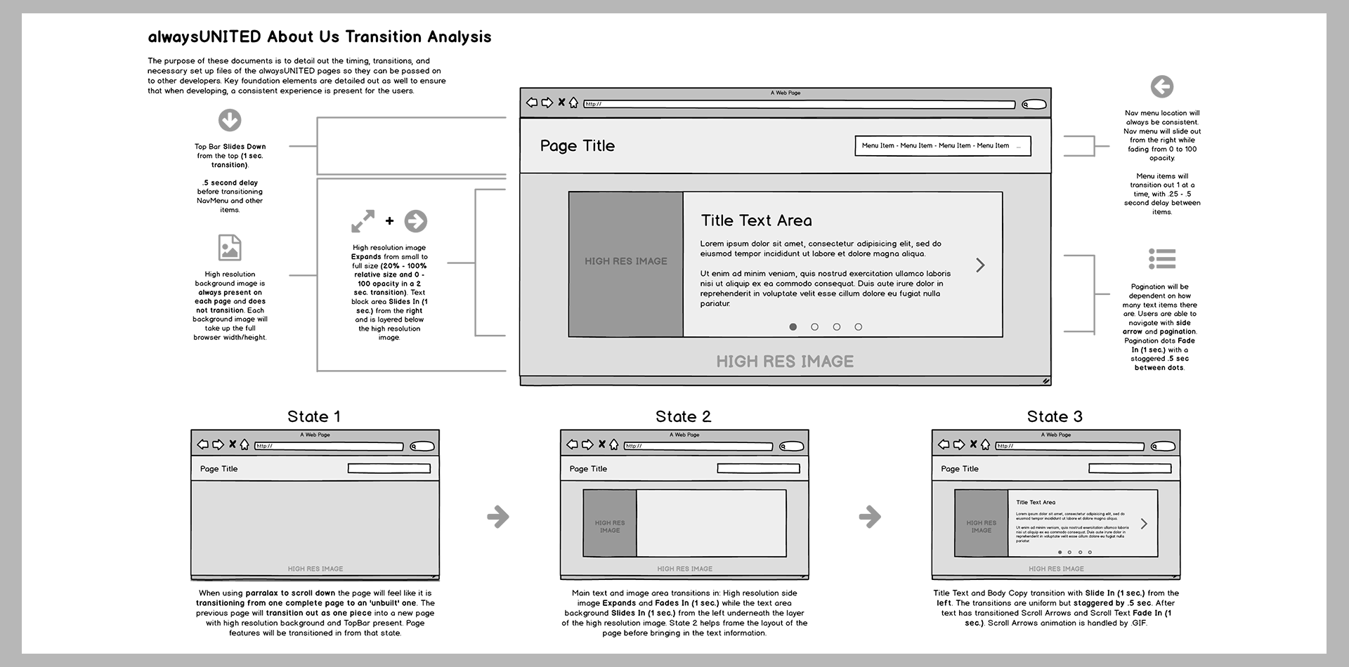
After the pages had been laid out into wireframes, I felt it was important to document the necessary Parallax transitions that would take place on each page. Sometimes designers and developers have to pass crucial information back and forth, and in order to assist this process I created a set of 'Transition Guides' which detail out all the timings and transitions required to build up the alwaysUNITED pages. These guides are an important part of the UI/UX process as they ensure all parties involved have the appropriate information needed to complete their stages of work.
Final Designs
The last step for the alwaysUNITED site was to combine the branding guide with the wireframes and flesh out the final page designs. These page designs would need to take into account all previous documented research and ensure that any design elements that I added worked towards the common goal of engaging and exciting users. The final designs would serve as the 'mixing bowl' full of design and conceptual ingredients that are working together. I laid the wireframes and final designs side-by-side and looked to highlight areas of design that worked well to bolster the content and to demonstrate the build up of layers of design and content on each page.
Services GiftedPixel Can Provide
Useful Links
Portfolio Breakdown
About
I'm a versatile designer who specializes in User Experience & Interface Design for the mobile/web environment.
My goal is to create beautifully structured designs that are memorable and get clients excited.